Skip to content
stacworks
All projects
Client · Case study

TimePay

A payments brand for a police foundation, built on a clock.

CLIENT

National Police Foundation

YEAR

2024

DISCIPLINES

Brand

ROLE

naming system, identity, guidelines, collateral

01 / The challenge

A police foundation was launching a payments app.Nobody downloads an app from the police.

The National Police Foundation built a platform that lets people pay a traffic challan, a railway ticket, a university fee or a housing instalment from one place, over the national rails. The product was sound. The problem was the sender. In Pakistan the payments people already trust look like consumer fintech, quick and bright, and a government service that looks like a government service does not get installed. The brief was an identity that could sit next to those apps on a home screen and lose nothing, while still reading as an institution you would trust with a fine.

02 / What we did
01Brand

A clock in the name, a dial in the mark.

The name already said it: time, then pay. The mark makes the first word literal. The dot of the i becomes a pivot, and over it sits a dial with its hand at one o'clock, a clock face and a speedometer at once: the payment is quick, and it is done. Time is set in the institution's navy, Pay in a red-orange that is the action, so the two words carry the two halves of the promise. Glancyr, with its rounded corners and stems, carries the same softness as the dial into every headline. And the tagline does the positioning in five words, in the language people actually use: Paisay bhejo, TimePay karo. Send the money, TimePay it. A brand you can say as a verb is a brand that has already been installed.

The primary logotype. Navy for the institution, red-orange for the action, and the dial over the i where a clock would put twelve.
03 / Visuals
How the mark is built. The dial is a circle; the i sits on its centre; the hand points to one o'clock, past twelve, because the payment has already gone through.
The four grounds the identity allows. Colour on white is the primary; white on navy, on red and on the gradient are the rest. There is no fifth.
The cards, filmed. A light sweep and a slow push, the objects still: the identity does not need to move to hold a frame.
The guidelines, turned: logotype, colour, the variants, type. Every spread is a rule and every chapter opens on the identity's own colour, and the book is on one grid throughout, header rule, section, page number, nothing else.
Stationery. The gradient runs along one edge of every piece so a stack of letterhead reads as one object from the side.
The notebook, with the pattern the dial makes when it is repeated: a spiral of arcs, printed tone on tone.
Pins on the same pattern. The tagline runs around the rim of the gradient one, small enough to be a secret.
The book, closed. The cover is the only place the identity is allowed a picture: the gradient made liquid, so the system's colours arrive before its rules.
Three copies. The spine carries nothing, so a shelf of them reads as one block of the gradient.
Open at the logotype. The mark, then its two lockups: every rule in the book is shown before it is described.
The colour variants and the clearspace. Three grounds, one diagram, and the mark holds its proportions on every one.
The colour chapter opens on the gradient made liquid: the one place in the book the identity is allowed a picture instead of a rule.
The typography chapter. Glancyr's A stacked at four weights, then the Aa tile on Brand Blue.
Out of home. The tagline is the whole message, in the language it is said in: Paisay bhejo, TimePay karo. No product shot, no app store badge.
Two colours and one typeface. Navy carries structure, red-orange carries every action, and Glancyr's seven weights cover everything from a headline to a receipt.
The website. The tagline as the headline, the gradient as the ground, the app in frame: the identity is the landing page.
PayPanel, the operator's side. A navy rail, white cards, red for the one action that matters on each screen, and the mark small in the corner where an operator sees it a hundred times a day.
The app. The wallet card wears the gradient, the service tiles wear navy, and the one red tile is the challan, because that is what most people open it for.
Cards. The three grounds as three objects, and the front carries what a card front carries: chip, contactless, number, name, expiry, set in the brand face so even the credentials are the identity.
In the street. The mark on the gradient reads at arm's length, which is the size it will actually be seen at.
Merchandise. The flag, the tee and the mugs all take the gradient whole, so the pattern and the mark never have to compete with a second colour.
The kiosk. White fascia, the mark above the screen and nothing else on it: in a hall of counters, the quiet unit is the one you can find.
At the counter. The same app on a stand, so the operator and the citizen see the same screen.
The pen. Navy barrel, red-orange grip: the two colours where the hand goes.
The bottle. The mark set vertically along the body, which is the one place it is allowed to turn.
The drives. White, so the two colours in the mark are the only colour on the object.
The notepad. The pattern printed white on white, visible only when the light catches it.
The website on a laptop. The identity is the landing page: gradient ground, tagline as headline, the app in frame, and nothing that needs explaining.
The guidelines, thirty-four pages, twenty-four of them here: introduction, logotype, typography, colour, and the applications, in the order a new supplier would need them.
04 / Outcome

One mark, two colours,and a name people say as a verb.

A thirty-four page guideline book covering the mark and its lockups, colour, type and placement, and the identity applied across print, merchandise, out-of-home and every digital surface the platform runs on: the website, the operator's PayPanel and the app in a citizen's hand. The mark is live today on the platform's own portal. What holds it together is discipline rather than ornament: one dial, one navy, one red, one typeface, and a system quiet enough that the tagline can do the talking.

Next project 09
All projects

OneHealth

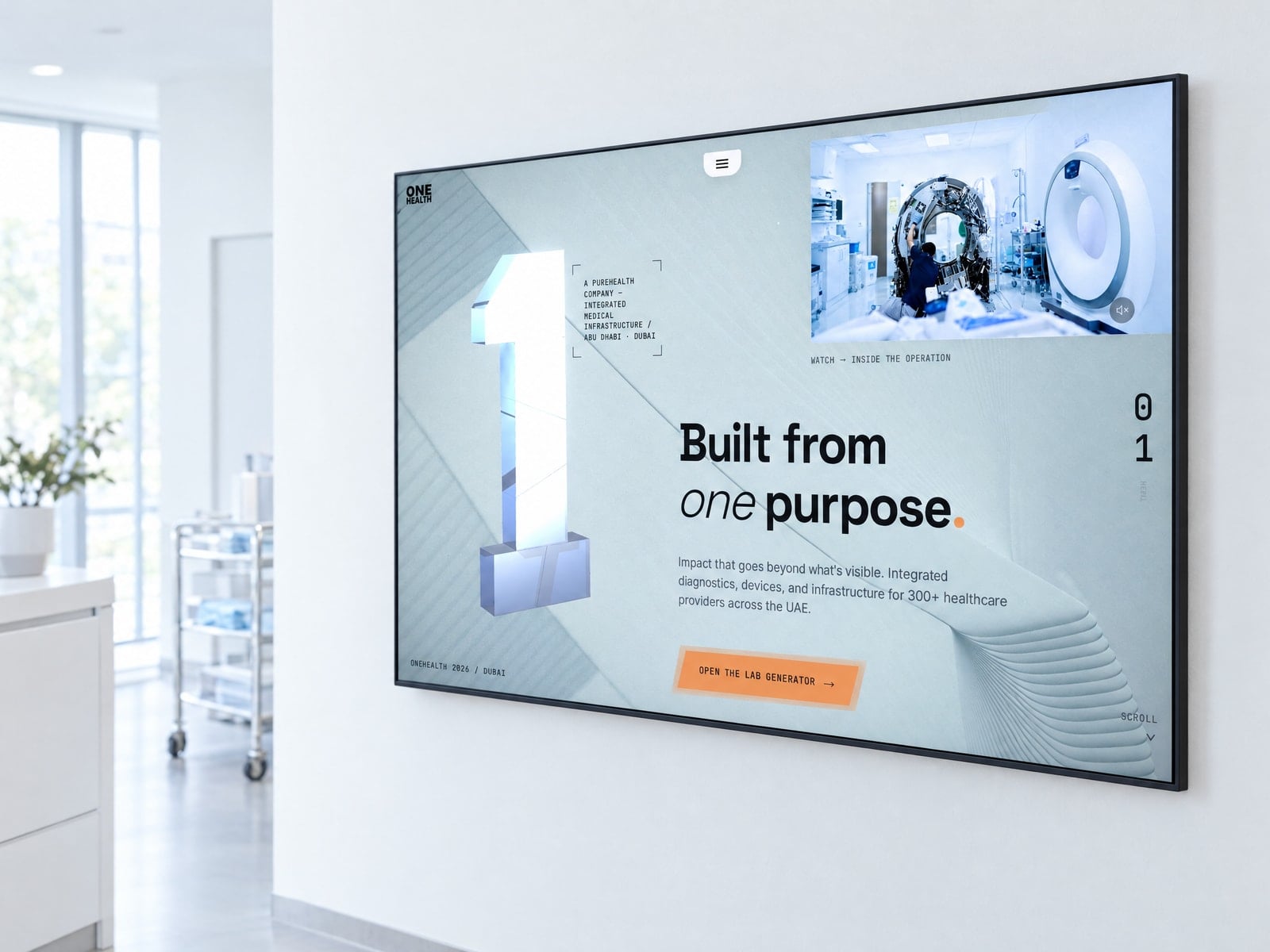
The OneHealth homepage on a large wall-mounted display in a bright clinical reception
Start a project

Let’s buildsomething thatstacks up.